
Follow the instructions below to adjust the vertical axes on the Terminal Labor/Sales Graph so that only a specified range of values is shown. To adjust the horizontal (time) axis, or other features on the graph, see Customize Labor vs Sales Graph.
To Adjust Labor/Sales Graph Vertical (y) Axes
1.Go to the Settings> Employee Options ![]() > Labor/Sales Graph tab.
> Labor/Sales Graph tab.
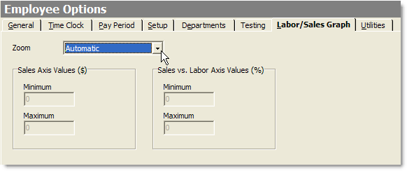
2. In the Zoom list, select one of the following settings:
•Automatic: Automatically adjusts the Labor/Sales Graph to show the data you've selected. This is the recommended setting, as it will allow you to view the full range of sales or labor data, from zero to the highest value.
•Manual: Allows you to manually set the two vertical (y) axes to show a specified range of values, in order to "zoom in" on a certain range of data. The adjusted axes will be applied to both the current day view and other days.
3.If you have selected Manual zoom, in the Axes Values fields, enter minimum and maximum values to define the range for each axis.
4.On the Edit menu, click Save Changes.
5.Refresh Terminal and touch the Labor Stats button on the User screen to see the adjusted graph axes.
See Also:
